Taylor Swift Brand Architecture: How Symbols, Colors, and Imagery Create a Mythos
Ready for it? Taylor Swift is not just a musician—she’s a storyteller whose narratives unfold not only in lyrics but also in the symbols, colors, and imagery she carefully cultivates. The Swift brand is a complex, interconnected mythology that resonates with fans and elevates each era she embodies. From serpents to butterflies, and a striking spectrum of reds, golds, and soft pastels, the architecture of Taylor’s brand is a masterclass in visual storytelling.
The Iconography of Taylor Swift: Symbols as Storytelling Devices
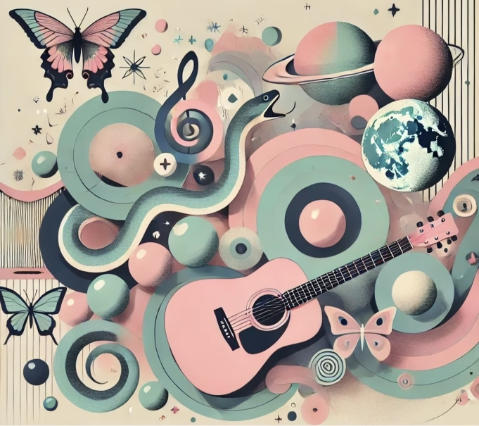
Taylor creates a cohesive brand identity through the recurring use of symbolic imagery. Take the snake, for instance. During the Reputation era, Taylor embraced the snake—a symbol of betrayal and rebirth—to reclaim her narrative amidst public scrutiny. The snake became a defining image that transformed negativity into empowerment. It resonated with fans who also felt the need to reclaim their own stories. By contrast, the butterfly emerged in Lover, symbolizing freedom, transformation, and a return to lightness after darker times.
These symbols aren’t random. They are deeply tied to Taylor’s personal journey, each serving as a chapter in her evolving mythos. The symbols provide fans with a shared language, creating a deeper bond between Taylor and her audience. When a new symbol emerges, it’s not just a design choice. It’s an invitation for fans to decode her next chapter.
Color Palettes as Emotional Narratives
Taylor Swift brand architecture uses colors in a deliberate and impactful way – to shape the emotional resonance of each era. In Red, the title was more than just an album name—it encapsulated the fiery, passionate feelings that permeated the songs. Red was love, anger, heartbreak, and everything in between. The album’s visuals matched that intensity, creating an era that felt visceral and unfiltered.
In contrast, Lover introduced pastels, pinks, and soft blues—colors that symbolized romantic optimism and new beginnings. These colors were a stark departure from the dark palette of Reputation. They signaled a shift in both Taylor’s outlook and sound. Each color scheme becomes a visual shorthand for the emotions Taylor explores, offering a holistic experience that goes beyond the auditory. It’s not just music. It’s a fully immersive world.
Imagery and the Creation of Taylor’s Mythology
Taylor also uses imagery that evokes specific emotions and ideas, adding layers to her storytelling. Consider the enchanted forests, old houses, and wistful autumns in Folklore and Evermore. These albums took on a cottagecore aesthetic, pulling fans into a world of nostalgia, mystery, and introspection. By crafting such vivid imagery, Taylor offers her audience a form of escapism—a journey into a world that feels both timeless and deeply personal.
This strategy plays into the collective nostalgia of her fans. Taylor’s use of imagery isn’t just about setting a scene. It’s about creating a shared experience. Fans remember where they were during each era, the imagery conjuring a sense of place and time that makes each album feel like a personal memory. This powerful tool helps transform her listeners into loyal, lifelong followers.

Merchandise and Symbols as Physical Connections
Another crucial element in Taylor’s brand architecture is the way she incorporates her symbols into merchandise. The snake rings, heart-shaped pendants, and Folklore cardigans are not just products. They are extensions of her storytelling. Merchandise becomes a way for fans to physically connect to Taylor’s narrative, to wear a piece of the era that meant something to them. The merchandise is often limited edition, enhancing its exclusivity and making it feel like a special part of the Swift experience.
These items aren’t mere souvenirs. They’re talismans that link fans to Taylor’s story. Wearing a piece of her merchandise is like wearing a badge that says, “I was there. I was part of this moment.” This attention to creating a personal, emotional connection strengthens her brand loyalty.
The Mythos of Taylor Swift: Crafting a Timeless Persona
Taylor’s brand isn’t just about who she is—it’s about what she represents. By thoughtfully curating symbols, colors, and imagery, she’s created a modern mythos—a story larger than the sum of its parts. This mythos gives fans a way to engage with her music beyond streaming or attending concerts. It invites them to decode, interpret, and feel like a part of the journey.
Taylor Swift’s mastery of visual storytelling sets her apart in an industry often focused solely on sound. The care she takes in building her brand’s architecture—one symbol, one color palette, one piece of imagery at a time—turns each album cycle into an era fans can live inside. Her fans aren’t just listeners. They’re participants in a shared myth, one that feels both intimate and infinite.
The Sisterhood in Her Squad: Emphasizing Female Friendship
Taylor has always celebrated female friendships, a form of power often undermined or dismissed by mainstream narratives. We think that Taylor Swift’s mastery of femininity is much more than simply showing the world that she can handle herself. It is about showing other women that they can have power, and helping to create an environment where men feel comfortable with powerful females. This creates strength among Swifties who are all united in the idea of equal power for all regardless of sex, race, or background.
Her high-profile “squad”—which included names like Selena Gomez, Gigi Hadid, and Karlie Kloss—was a statement that women can lift each other up rather than compete. This public emphasis on supportive female relationships challenges the old trope of women tearing each other down. The Bad Blood video was a notable celebration of women in unity, even if it was framed within a vengeful aesthetic.

Taylor Swift Brand Architecture – Ray Swift’s Take
Alright, Swifties, let’s talk about it. Taylor isn’t just putting out albums—she’s building entire worlds for us to get lost in. The way she uses symbols and colors? She’s creating these little universes we can enter and feel at home in. Who else can take something like a snake—a literal emblem of betrayal—and turn it into a sign of empowerment that we proudly wear on jewelry? Only Taylor.
The colors too—Red was the color of every intense emotion you’ve ever felt, while Lover made us want to run through fields of daisies in pastel dresses. And don’t get me started on Folklore. It’s like she reached into our collective daydreams and brought them to life.
Taylor’s magic is that she doesn’t just make music; she makes eras. She gives us symbols, colors, and stories to carry with us. It’s why, no matter what life stage we’re in, there’s always a Taylor album that feels like home.
Leave your thoughts in the comments, Swifties! Do you love the way Taylor Swift uses imagery to create her brand?
Head back to news for more stories and articles for more deep dives
Ray Swift ✨🌿🐍
